Zuma used to say that Africa is actually much bigger than it is represented on world maps. I thought he was lying, but it is actually true.
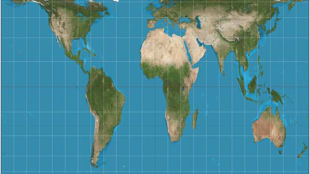
Most of us grew up with the Mercator world map – the one that makes Greenland look almost as big as Africa. Reality check: Africa is about 14× larger than Greenland.
It covers roughly one-fifth of Earth’s land.
You can fit the US, China, India and most of Europe inside it and still have room.
The Mercator projection was designed for 16th‑century sailors, not for showing true size. It stretches everything far from the equator, so high‑latitude countries look huge and equatorial ones (like Africa) look small.
In 2026, the UN backed a move away from Mercator toward equal‑area maps like Equal Earth, which show continents at their real relative sizes. On those maps, Africa finally looks like what it is: the second‑largest continent on the planet.